
CTTC Rebrand
Statewide positioning, visual identity, and a 34-page brand guidelines system—so every team ships the same California Transit Training Consortium story.

Where they started
CTTC trains the people who keep public transit running in California. As the consortium grew from a regional program into a statewide resource, leaders kept hearing the same friction: “Who are we, really?”
Staff and members already said CTTC, but the legal name was still the Southern California Regional Transit Training Consortium, and public materials still carried regional Southern California cues. Marketing, training, and partner teams needed one documented system—not one-off interpretations of the logo and colors.
Identity shift
Before
Southern California Regional Transit Training Consortium
scrttc.com
Legacy three-bar mark, navy-and-gold collateral, and regional membership messaging—including join.scrttc.com—that didn’t match how members already talked about CTTC.

After
California Transit Training Consortium
cttc.com
A statewide name, mentorship-driven logo, and a documented visual system—plus cttc.com, brokered by Geogram to replace the legacy SCRTTC address at scrttc.com.

Rebrand & positioning
Grounded in marketing assessment and stakeholder input, the new identity reframes CTTC as a statewide consortium—colleges, transit agencies, and partners united to advance California’s transit workforce.
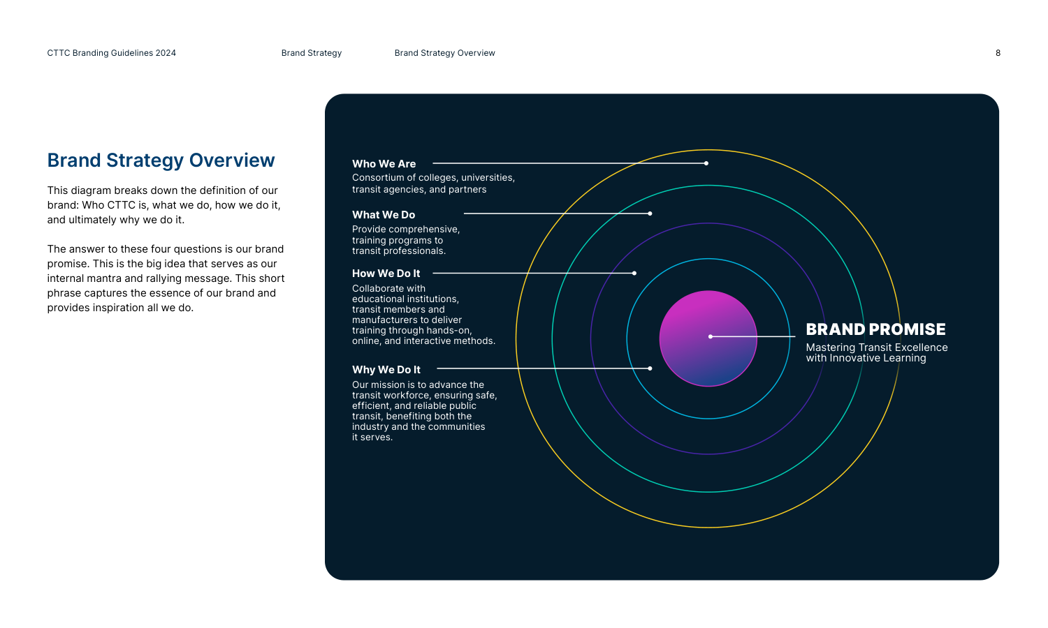
Mastering Transit Excellence with Innovative Learning
Brand promise
Who we are
Consortium of colleges, universities, transit agencies, and partners.
What we do
Provide comprehensive training programs to transit professionals.
How we do it
Collaborate with institutions, members, and manufacturers—hands-on, online, and interactive delivery.
Why we do it
Advance the transit workforce for safe, efficient, reliable public transit across the communities we serve.
Education
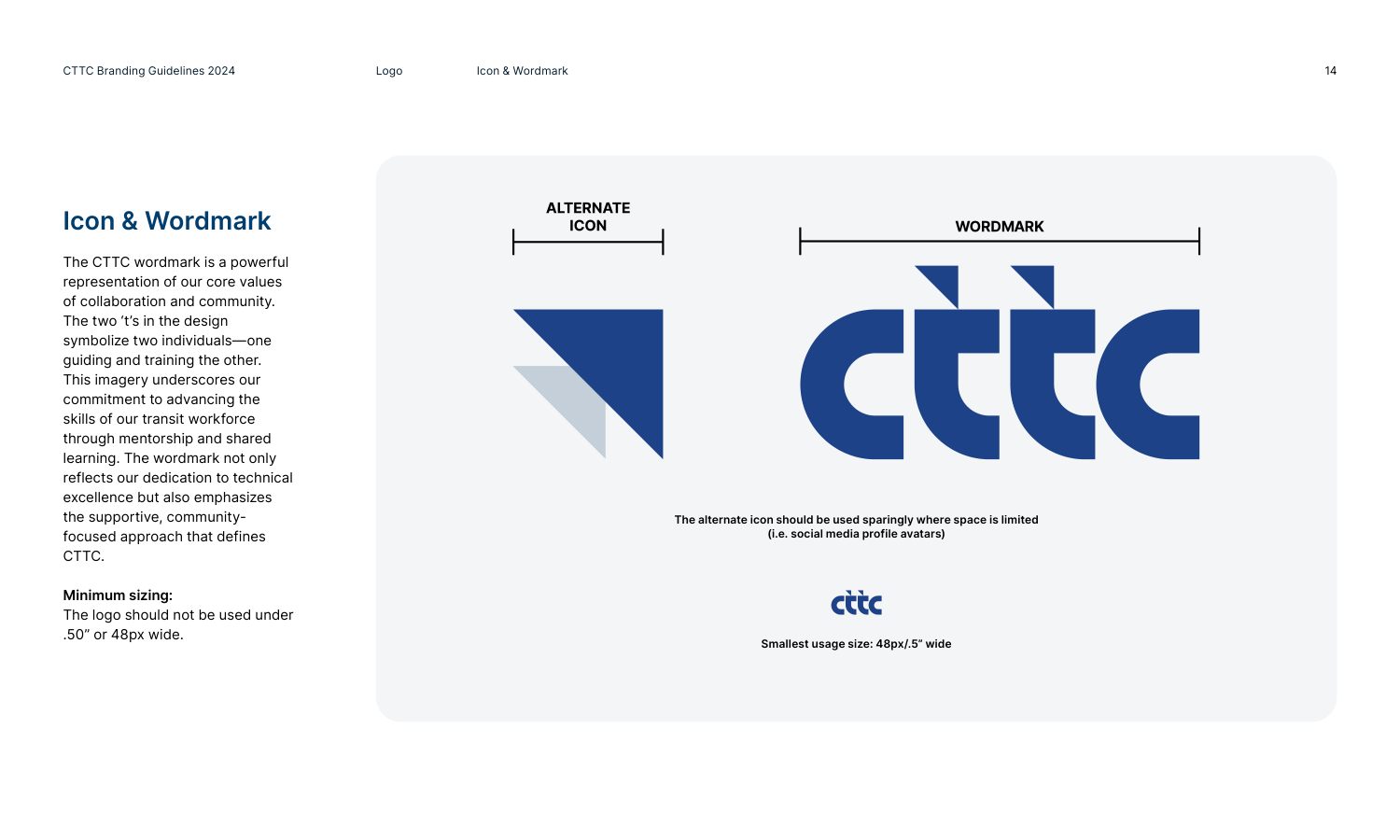
CTTC was founded on agencies joining forces—collectively building a sustainable training model. The logo’s two Ts symbolize one person guiding another; that mentorship story carries through collateral and course materials.
Innovation
Curriculum turns complex transit topics into digestible learning. Visual language pairs Innovation and Education to activate the promise across digital, print, and environmental touchpoints.
Brand guidelines
Geogram delivered a 34-page brand guidelines book—strategy, logo, color, typography, visual principles, and usage rules—so marketing, training, and partner teams ship consistent work without guesswork.
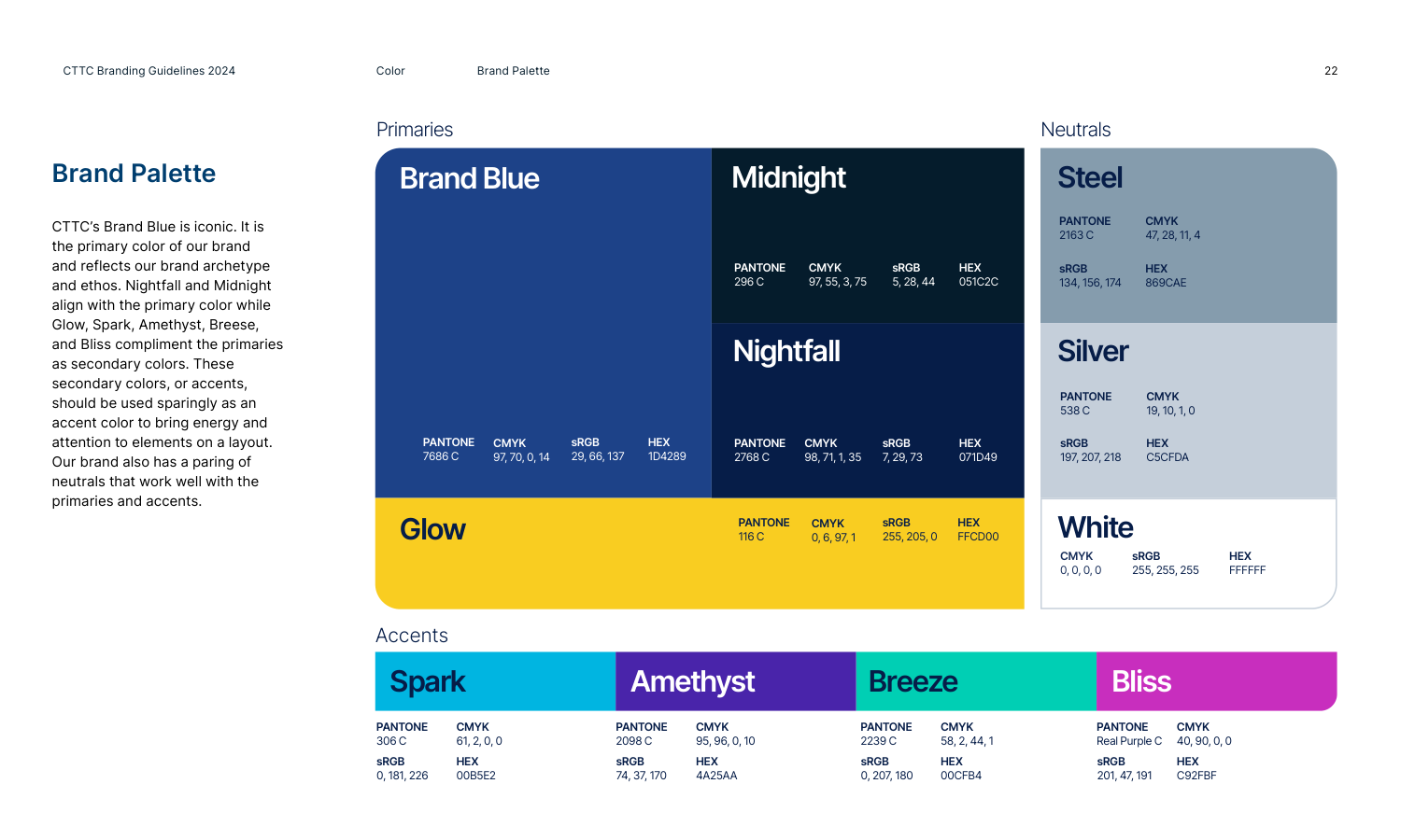
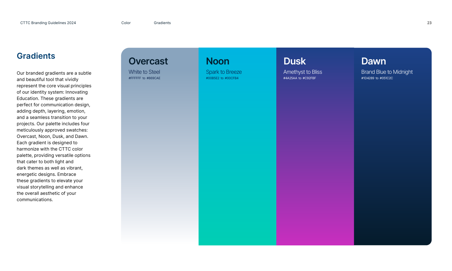
The system defines a precise brand promise, mentorship-driven logo story, and a palette built for light and dark themes—then extends into gradients, type, icons, and apparel applications.
- Brand strategy & promise
- Logo, clear space & misuse
- Color, gradients & themes
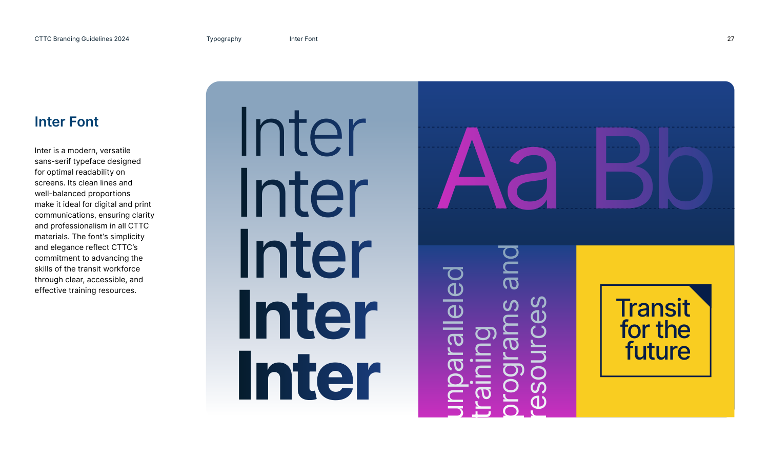
- Inter & Bodoni Moda typography
- Visual elements & apparel
- Expo & environmental graphics
Color system
Gradients
Typography
Inter — UI, body copy, and screen-first communications across the site and guidelines.
Bodoni Moda — formal headings, grants, and stakeholder presentations (title case).
Expo & environmental
The brand doesn’t stop at the screen. For trade shows and member events, Geogram applied the same promise, gradients, and track icons to a full backdrop—so CTTC owns the room the way it owns cttc.com.
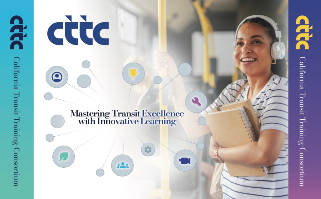
- Side panels — Noon (Glow → Breeze) and Dusk (Spark → Amethyst) gradients with vertical lockup
- Center story — brand promise in display type with icon constellation for training tracks
- Human moment — lifestyle photography tying learning to real transit work
Deliverables
Positioning & promise
Statewide naming, brand promise, and a who / what / how / why framework aligned with the acronym agencies already used.
Logo & visual identity
Wordmark and icon with mentorship story, color system, gradients, typography, and apparel applications.
Brand guidelines
34-page identity book—usage rules, co-branding, environmental graphics, and trade show systems.
Domain acquisition
Geogram brokered the acquisition of cttc.com—giving CTTC a short, memorable URL that matches the acronym members already used and replacing the regional scrttc.com (SCRTTC) identity online.
The result
CTTC now has a confident, documented identity—Mastering Transit Excellence with Innovative Learning—that teams can apply across the marketing site, member portal, print, and events without guesswork.